Instagram Tests New Layout Prioritizing Reels and DMs in Latest Redesign
Instagram is testing a major redesign that emphasizes Reels and Direct Messages, signaling a shift toward video-first engagement and private interactions, according to Adam Mosseri.
NEWS
10/12/20252 min read
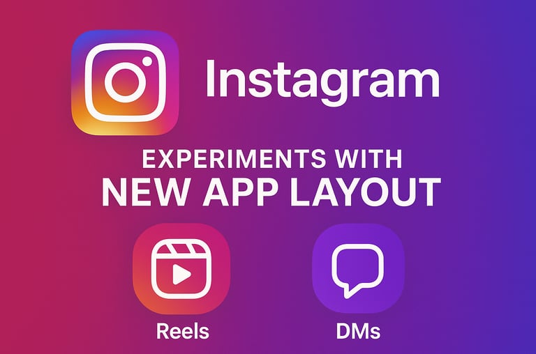
Instagram Experiments with a New App Layout, Prioritizing Reels and Direct Messages in Major Redesign
Instagram is once again testing a significant redesign of its app interface — this time focusing heavily on Reels and Direct Messages (DMs). The move marks another major step in Meta’s ongoing effort to realign the platform toward short-form video and private interactions, as confirmed by Instagram head Adam Mosseri in a recent announcement.
A Fresh Layout Focused on Reels and Private Chats
According to Mosseri, the experimental redesign introduces dedicated tabs for both Reels and DMs directly on the main navigation bar. This change alters the traditional layout that users have grown accustomed to, moving the Search and Reels buttons to new positions while replacing the familiar “Create Post” button with a shortcut to Direct Messages.
The redesigned layout also allows users to swipe between sections, creating a smoother and more intuitive navigation experience. This gesture-based control is part of Instagram’s plan to make the interface feel more natural while emphasizing the features that drive the most engagement.
Why the Shift?
Explaining the motivation behind these changes, Mosseri stated, “Reels and DMs have driven most of our growth over the last few years.” He emphasized that these features have become the backbone of Instagram’s evolution — moving from a simple photo-sharing app to a vibrant hub for video content and private social interactions.
While the redesign is currently limited to a testing phase, users participating in the experiment will have the option to switch between the new and old layouts. This optional rollout is meant to gather user feedback before a wider release.
Part of a Broader Meta Strategy
The experimental redesign is part of Meta’s wider push to enhance user engagement across its ecosystem. Recently, Instagram also launched its long-awaited iPad app, which is now globally available on the App Store. The app has been specifically optimized for larger screens, with Reels appearing as the default tab, reinforcing Instagram’s growing emphasis on video-first experiences.
This iPad version represents more than just convenience — it signals a deliberate shift in the company’s focus from traditional public photo-sharing toward private, personalized, and creative interactions.
Evolving Beyond Photo-Sharing
Instagram’s transformation reflects a broader trend in how users engage on the platform. While photos once dominated feeds, today’s users are more active in private group chats, sharing content within close circles rather than broadcasting publicly. These smaller, creativity-driven communities are shaping the next chapter of Instagram’s identity.
The redesign aims to mirror this behavioral shift, transforming Instagram into a hybrid space — a hub for both content discovery and meaningful conversations. By integrating easier access to messaging and emphasizing video engagement, the platform seeks to capture how users actually connect and create in 2025.
What This Means for Users
For now, the redesign remains in the testing stage, and not everyone will see the changes immediately. However, it hints at where Instagram is heading: a more dynamic, video-centric, and conversation-driven platform that aligns with evolving social media habits.
As Meta continues to innovate, the boundaries between content creation, discovery, and communication on Instagram are becoming increasingly blurred — turning the app into a space where connection and creativity coexist seamlessly.